Walmart Navii
January 2025 - Present
Role: UI/UX Designer
Walmart shoppers often spend excessive time navigating large stores to find items on their list, leading to frustration and inefficiency.

IDENTIFYING THE CORE ISSUE
ABOUT THE PROJECT
This project aimed to enhance the in-store shopping experience for Walmart customers by designing a feature within the Walmart mobile app that allows users to input a shopping list and receive an optimized route through the store to collect all items efficiently. By leveraging store map data and route optimization algorithms, the vision was to reduce shopping time, minimize navigational frustration, and improve overall customer satisfaction.
WHO IS THE USER
The user category and main persona are inclusive of all people who shop at a physical Walmart store. Families, working professionals, seniors, students, people with special needs, and people with accessibility issues are all part of this diverse group, and each has different expectations and shopping habits when navigating big shops.
The core user persona represents the typical Walmart shopper—someone who prioritizes efficiency, ease, and a seamless in-store experience. They are looking for a digital feature that helps them find products quickly, avoid unnecessary walking, and guides them through the store with a smart, accessible, and personalized route.
PROBLEMS ADDRESSED BY THE DESIGN
The design addresses several pain points faced by Walmart in-store shoppers:
Walmart’s in-store shopping experience has long focused on helping customers find and purchase what they need. Yet, continuous user feedback has revealed several usability concerns.
Existing solutions lack dynamic, real-time navigation tailored to a user’s specific shopping list and store layout.
Shoppers often backtrack or take suboptimal routes when collecting items, increasing shopping time.
Customers struggle to organize and prioritize items on their shopping lists within the store context, especially for large lists.


Accessibility Issues:
Lack of Real-Time & Personalized Navigation:
Difficulty Managing Lists:
Inefficient Shopping Paths:
People with mobility issues face greater difficulty when traversing the entire store inefficiently.
USER PAINPOINTS
#1
Users often come with long shopping lists.
When trying to locate multiple items on the map,
They are forced to search for one item at a time.
Through user interviews, in-store observations, and app analysis, I uncovered key pain points in how customers navigate the store and interact with the app.
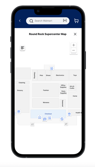
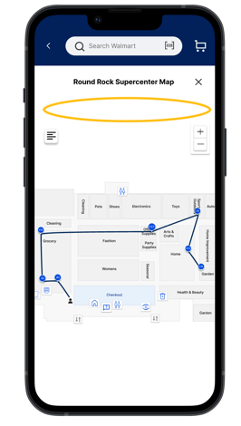
Current experience
This results in constant switching between the list and the map. The experience feels disjointed and time-consuming. It breaks the flow and reduces overall efficiency.
#2
Shopping often begins without a clear route, relying on memory or guesswork to decide which items to find first. This lack of direction leads to inefficient navigation, causing shoppers to backtrack or miss aisles altogether.
As a result, they end up walking longer distances than necessary, adding both time and frustration to the in-store experience.
Current experience
#3
Sometimes, users forget an item in the middle of their trip. By the time they realize, they’ve already passed the aisle. This means they have to walk back to retrieve it.
It disrupts the natural flow of shopping.
The extra walking adds unnecessary effort and time.
Overall, it makes the experience less efficient and more frustrating.

Current experience
A detailed exploration of user challenges—particularly at critical points where shoppers lose engagement—combined with the rising demand for more intelligent and user-friendly navigation tools.
REDESIGN STRATEGY
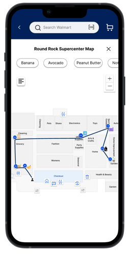
#1
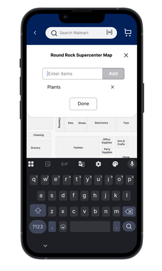
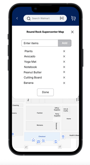
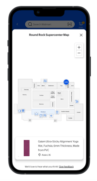
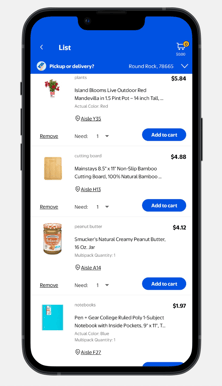
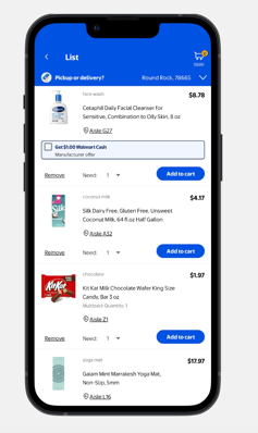
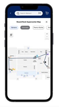
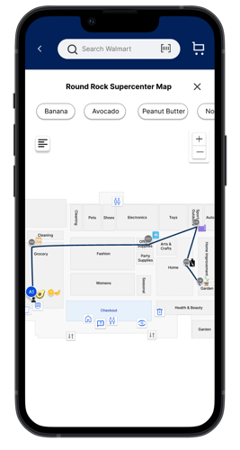
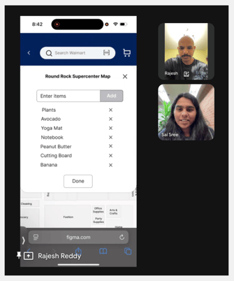
I integrated the shopping list into the map view, enabling users to find items without switching between screens, which helps reduce mental effort and keeps them oriented within the store.
This combined interface allows real-time progress tracking, making the shopping experience more intuitive, focused, and time-efficient.
New Design
As a designer, I focused on making it easier for shoppers to find their way around Walmart’s big stores. My goal was to build a simple, helpful experience that works for all kinds of customers, including those with different needs or abilities.
This minimizes unnecessary backtracking, reduces walking time, and creates a smoother, faster, and less frustrating in-store experience.
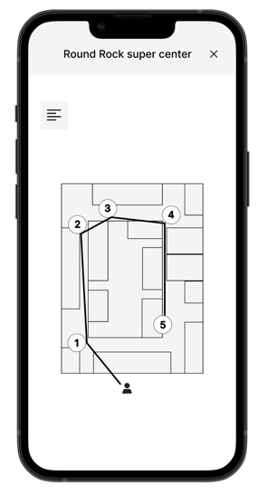
I designed a system that generates optimized routes using shortest-distance algorithms, guiding shoppers through the most efficient path to find all items on their list.
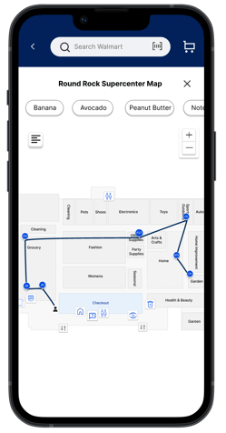
#2
New Design

This helps maintain the shopping flow, reduces extra walking, and makes the experience smoother and more efficient.
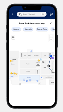
I implemented dynamic rerouting that automatically adjusts the path when an item is forgotten, offering an alternative route that avoids unnecessary backtracking.
#3
New Design
KEY DESIGN DESICIONS
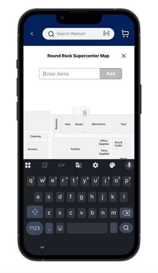
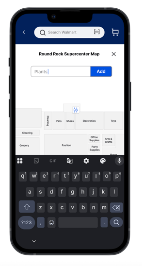
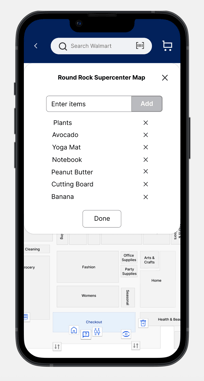
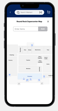
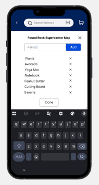
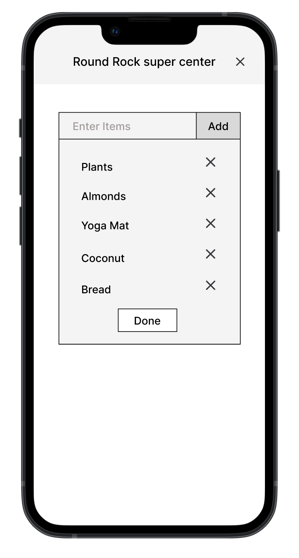
Initially, the map screen did not display the shopping list after it was entered, forcing users to switch back and forth between views. To reduce this friction, I made the decision to integrate the shopping list directly into the map screen.
This allowed users to view their list and route in one place, improving focus, reducing confusion, and streamlining the overall shopping experience.
Iteration 1
Iteration 2
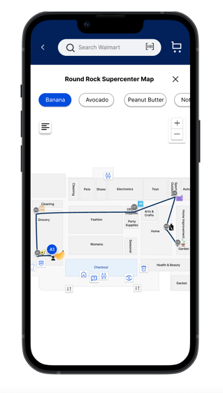
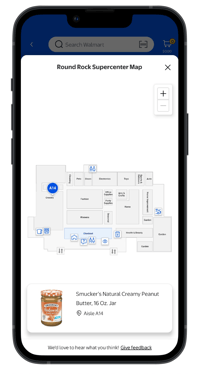
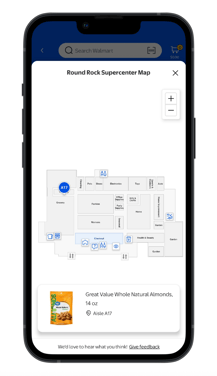
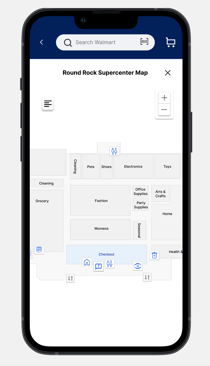
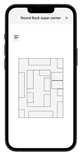
At first, the map did not include visual indicators for the listed items, making it challenging for users to identify where each product was in the store.
I added item-specific symbols directly onto the map, positioned near their respective locations to address this.
Iteration 3
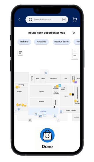
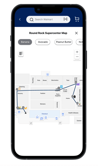
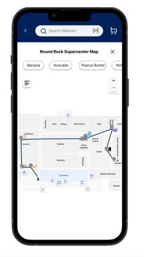
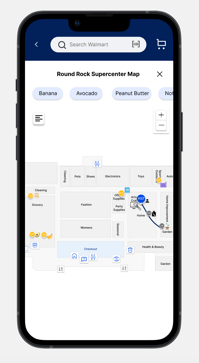
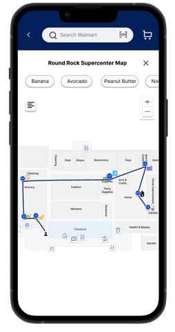
I replaced the single blue item marker with a color-coded system to improve clarity and align with Walmart’s store theme.
Grey indicates unvisited items, blue shows the current item location, and yellow marks items that have already been picked, making it easier for users to track progress and navigate efficiently.
Iteration 4
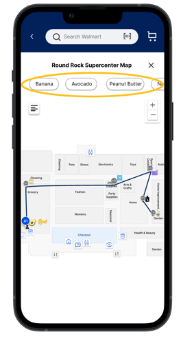
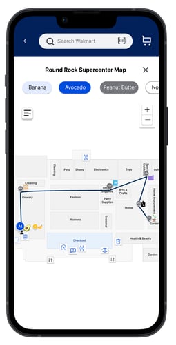
I applied a visual highlighting method to the shopping list that aligns with the map’s indicators—using light blue for visited items, Walmart blue for the current item, and grey for the upcoming one—making the shopping path easier to follow.
All other items are shown in white with a black outline, ensuring high readability and visual contrast throughout the experience.
This is how I focused on the small details to create smart, helpful features for the Walmart in-store map screen.
INSPIRATION
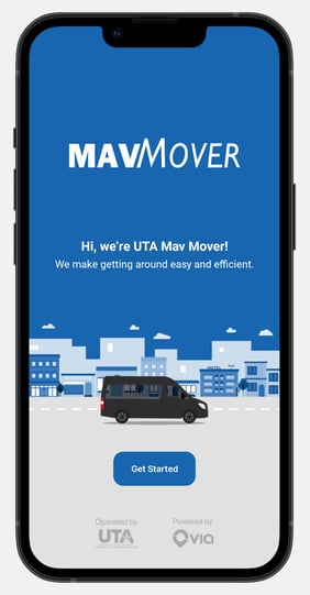
The idea for optimizing in-store navigation at Walmart was inspired by my experience using UTA Mav Mover, the night time transportation service at the University of Texas at Arlington. Mav Mover operates using shortest-distance algorithms to reduce travel time.
For example, if Student 1 books a ride first and Student 2 books later, but Student 2's destination is closer, the system intelligently drops off Student 2 before Student 1. This approach minimizes the total distance traveled, regardless of the order in which rides are requested.
Drawing from this logic, I applied a similar distance-optimized routing method to the in-store shopping experience. The goal was to help users reach all items on their list using the shortest and most efficient path possible, saving time and effort during their trip.
USER SURVEYS & INTERVIEWS
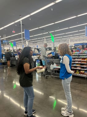
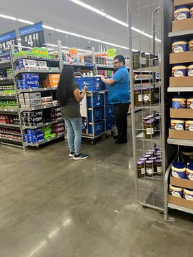
To deeply understand shopper behavior and uncover friction points in the in-store journey, I conducted a combination of user surveys and in-person interviews with Walmart customers as well as Walmart employees. My goal was to identify not just what users were experiencing, but why—so I could design solutions grounded in real needs.
Objectives
Methodology
Key Insights
Understand how shoppers plan and navigate in-store trips.
Identify pain points in item-finding and store layout.
Explore how different user groups interact with the Walmart app.
Surveyed 40+ shoppers from diverse backgrounds.
Conducted 10 in-depth interviews (in-store + virtual).
Observed real-time shopping behavior during different store hours.
70% felt overwhelmed in large stores, especially with long lists.
Most relied on memory or signs; app usage for navigation was low.
Forgetting items and frequent backtracking frustrated users.
These insights guided my design decisions—leading me to create real-time directions, an easier-to-use interface, and features that adapt to the shopper’s situation.
USABILITY TESTING
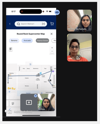
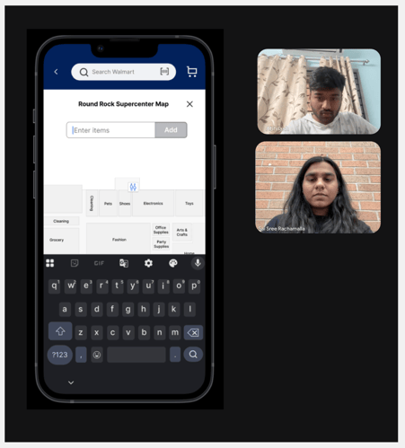
Adhi Lakshmi
Rajesh Reddy
Abhilash
Age : 37
Working women with two kids
Busy working professional
Age : 40
Age : 23
Masters student
LOW-FIDELITY WIREFRAMES
RESEARCH: COMPETITIVE & SWOT ANALYSES
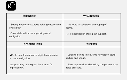
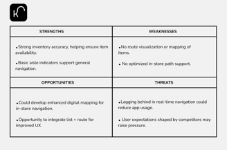
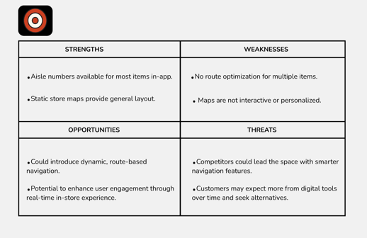
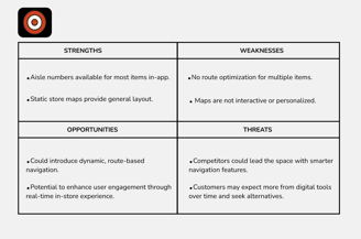
While both Target and Kroger offer foundational digital tools to assist with in-store shopping, such as item-level aisle information, basic store maps, and integrated shopping lists, neither platform delivers a truly personalized, route-optimized navigation experience. Their solutions remain largely static and reactive, requiring users to piece together their journey manually rather than guiding them efficiently through the store.
WALMART NAVII TAUGHT ME
Working on Walmart Navii was a deep dive into solving real-world problems at scale. It taught me how to simplify complexity, turning crowded store layouts and long shopping lists into clear, guided experiences. I learned the power of designing with empathy, especially when addressing the needs of diverse users like seniors and busy parents.
From research to prototyping, every step pushed me to think bigger and more intentionally, transforming insights into meaningful, user-centered solutions.